Building and Designing Tech for hard problems
︎ Home
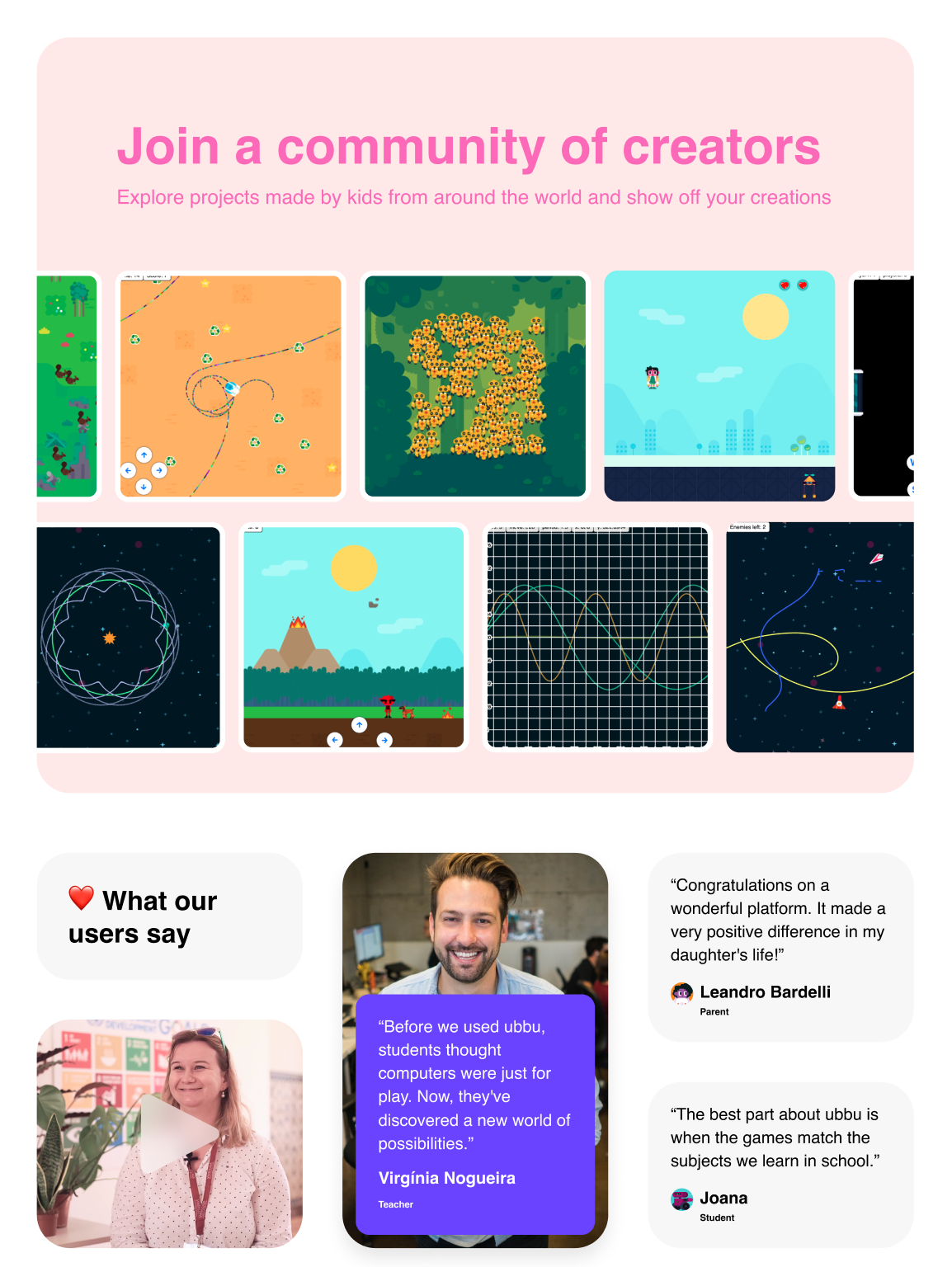
Featured work
Nazare Space Capsule
StarKnight Suit
Draco Sportscar
Rosas Moon Base
uBike
ubbu
Accua
Gleam
Spiro
Intersection Ventures
Protevs
BEETHEFIRST
Blog
Services
Behind the scenes
Astrophotography
x.com

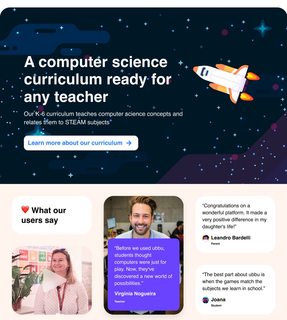
ubbu has been meticulously designed with the help of educators to both enable and empower teachers of all fields, and help kick off their school's innovation journey.
For more, follow the project at www.ubbu.io
For more, follow the project at www.ubbu.io
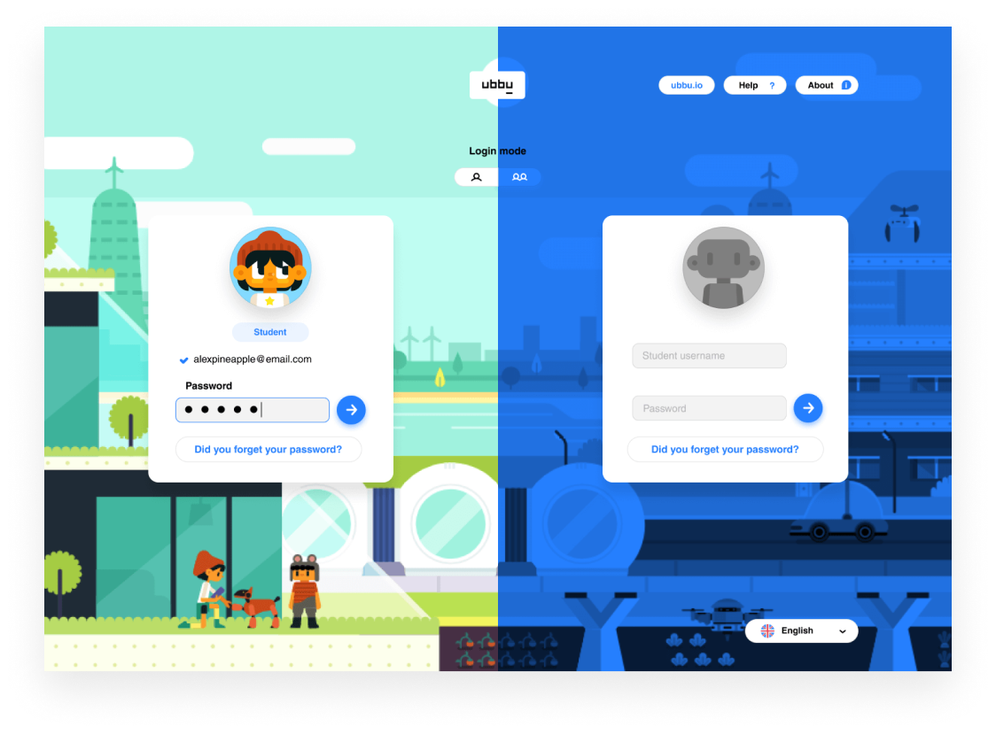
That's why ubbu allows its users to login as a team. This feature also showed benefits kids as they learn extremely important social skills with the group exercises.
As important as the team login, ubbu is also designed for both online and offline environments. The connected school is becoming a reality, but until then, teachers need to rely on offline able solutions.
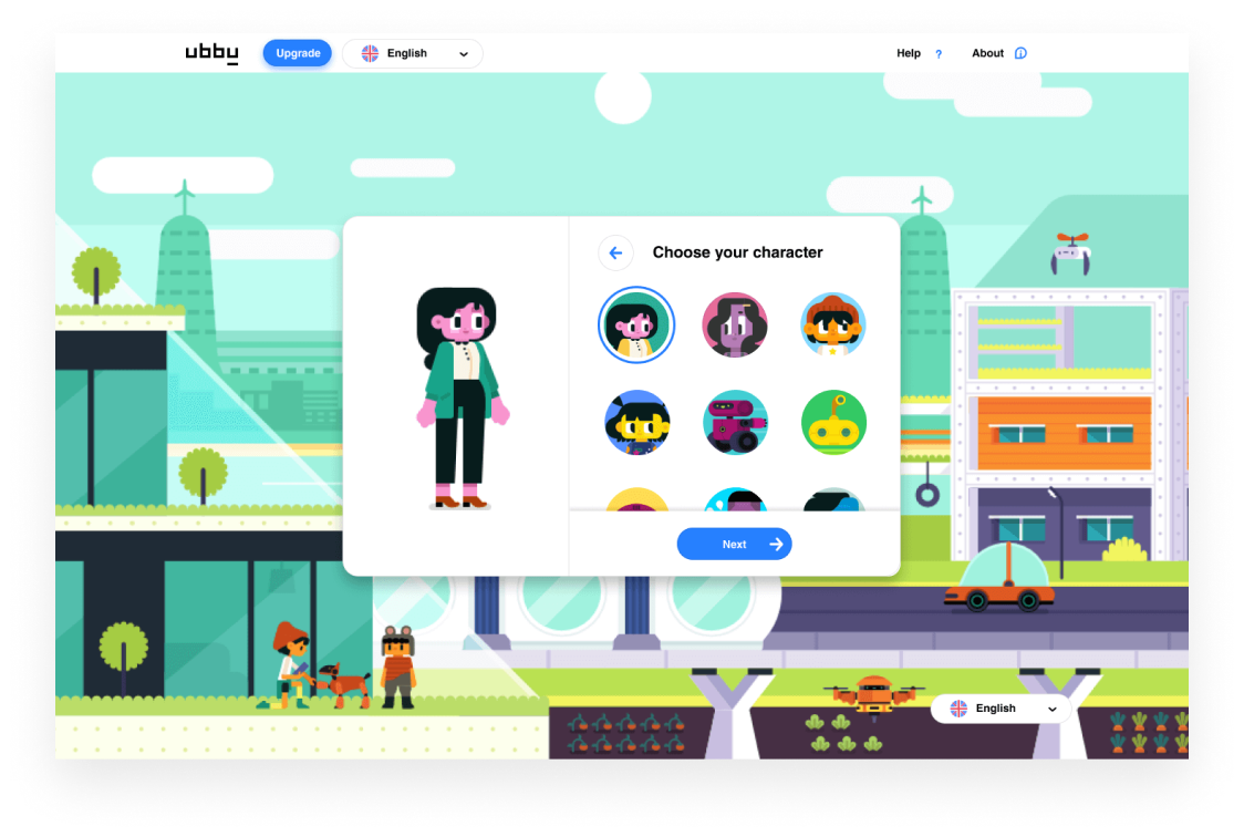
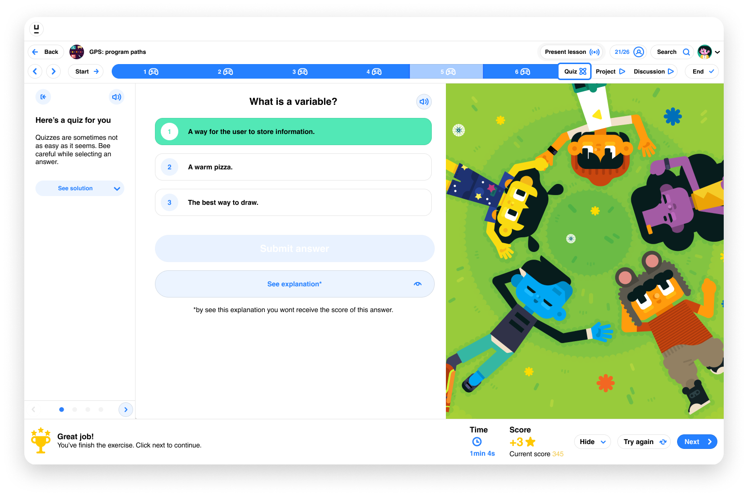
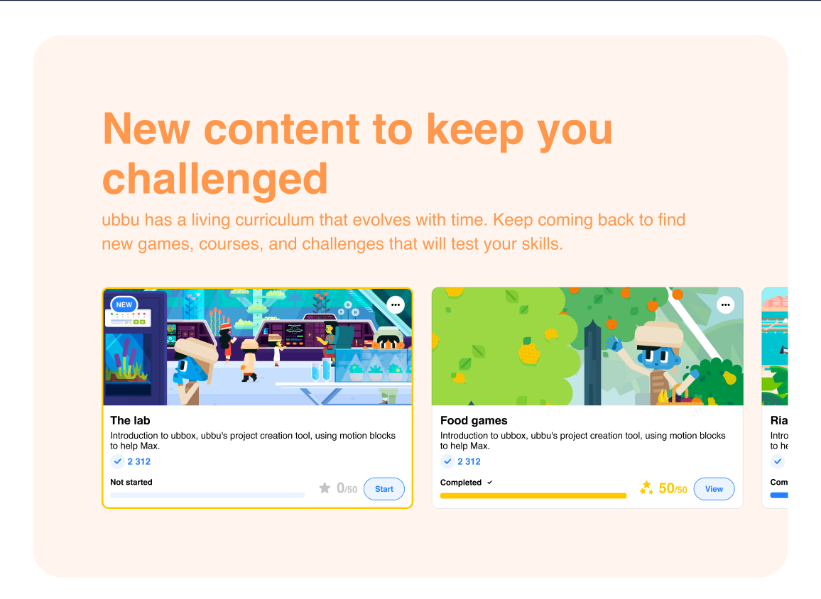
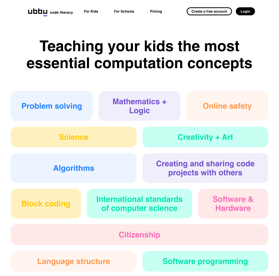
Inside ubbu, there's a curriculum of games and videos, all designed by ubbu's own content team.
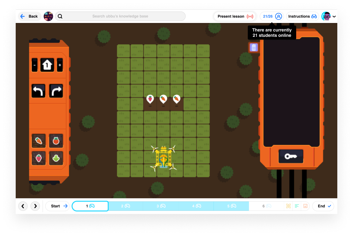
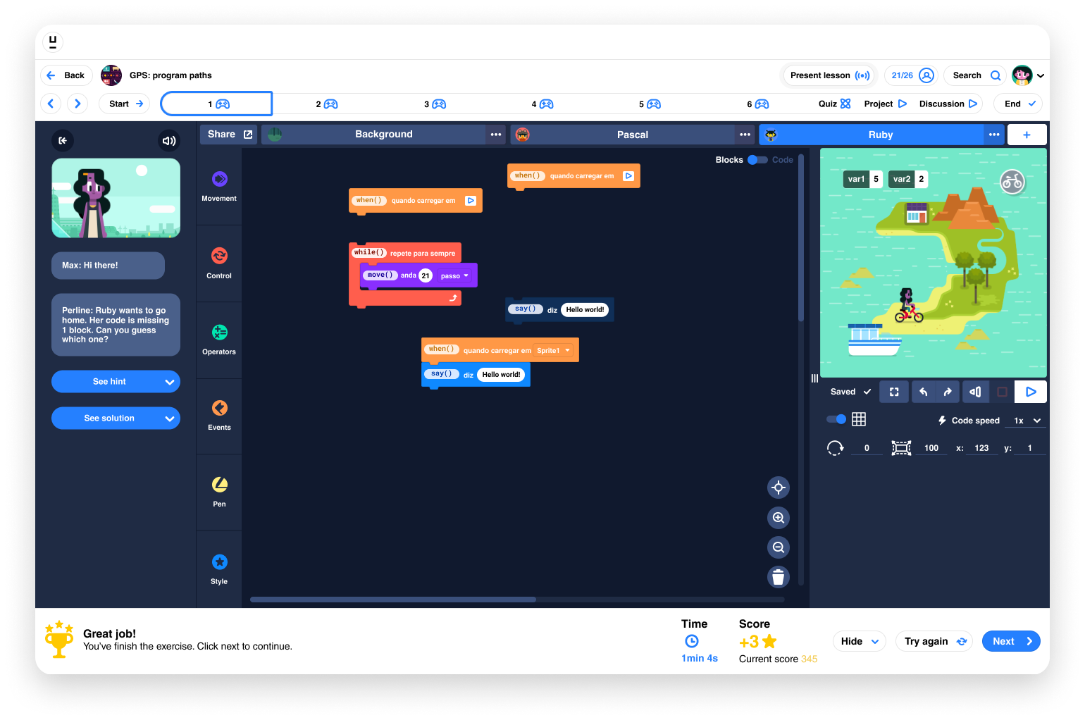
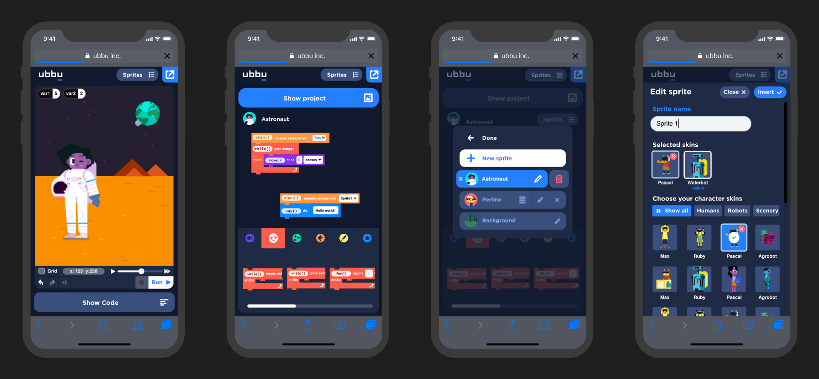
At the end of the learning curve, ubbu has its own block coding tool: ubbox. With it, kids can create code projects and share them with their peers.
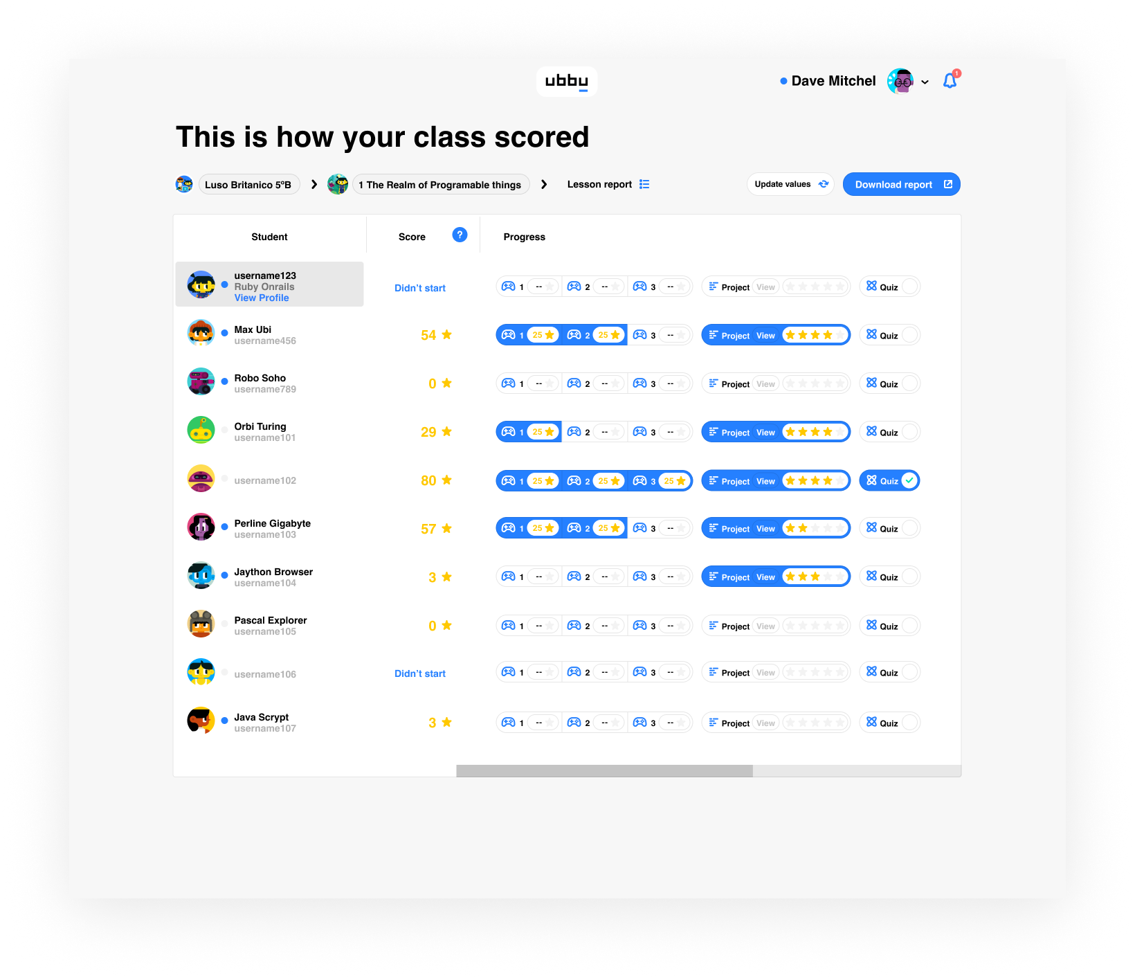
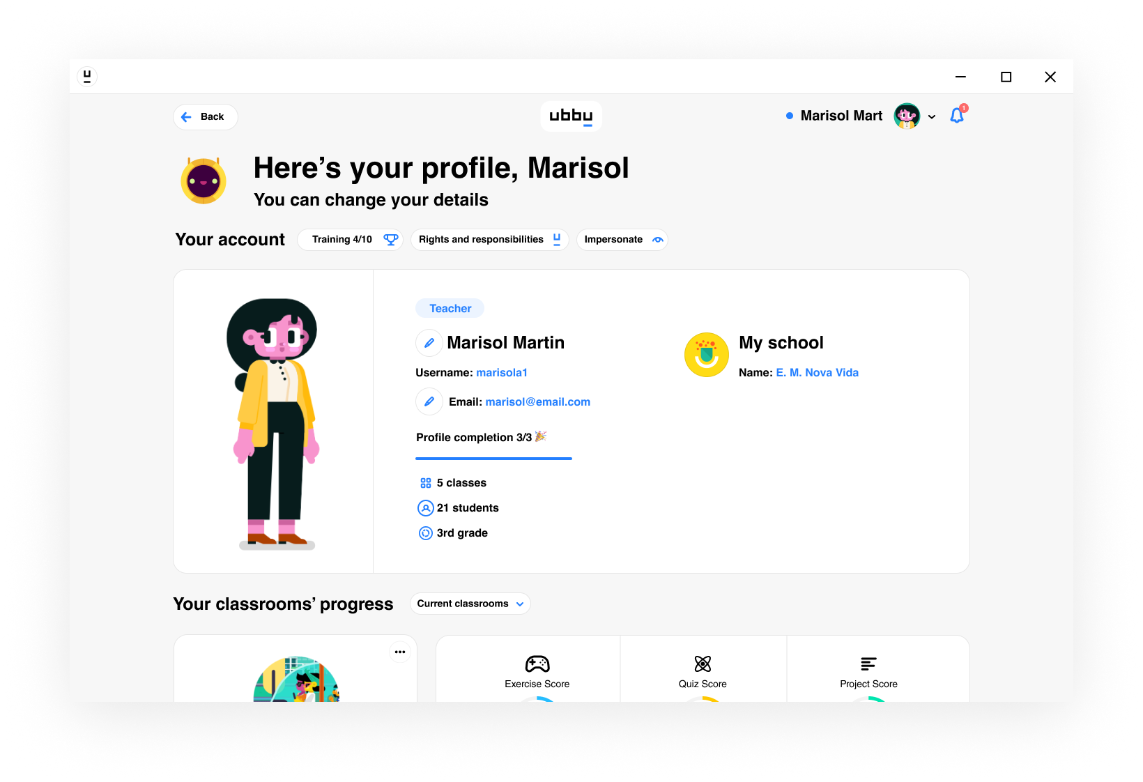

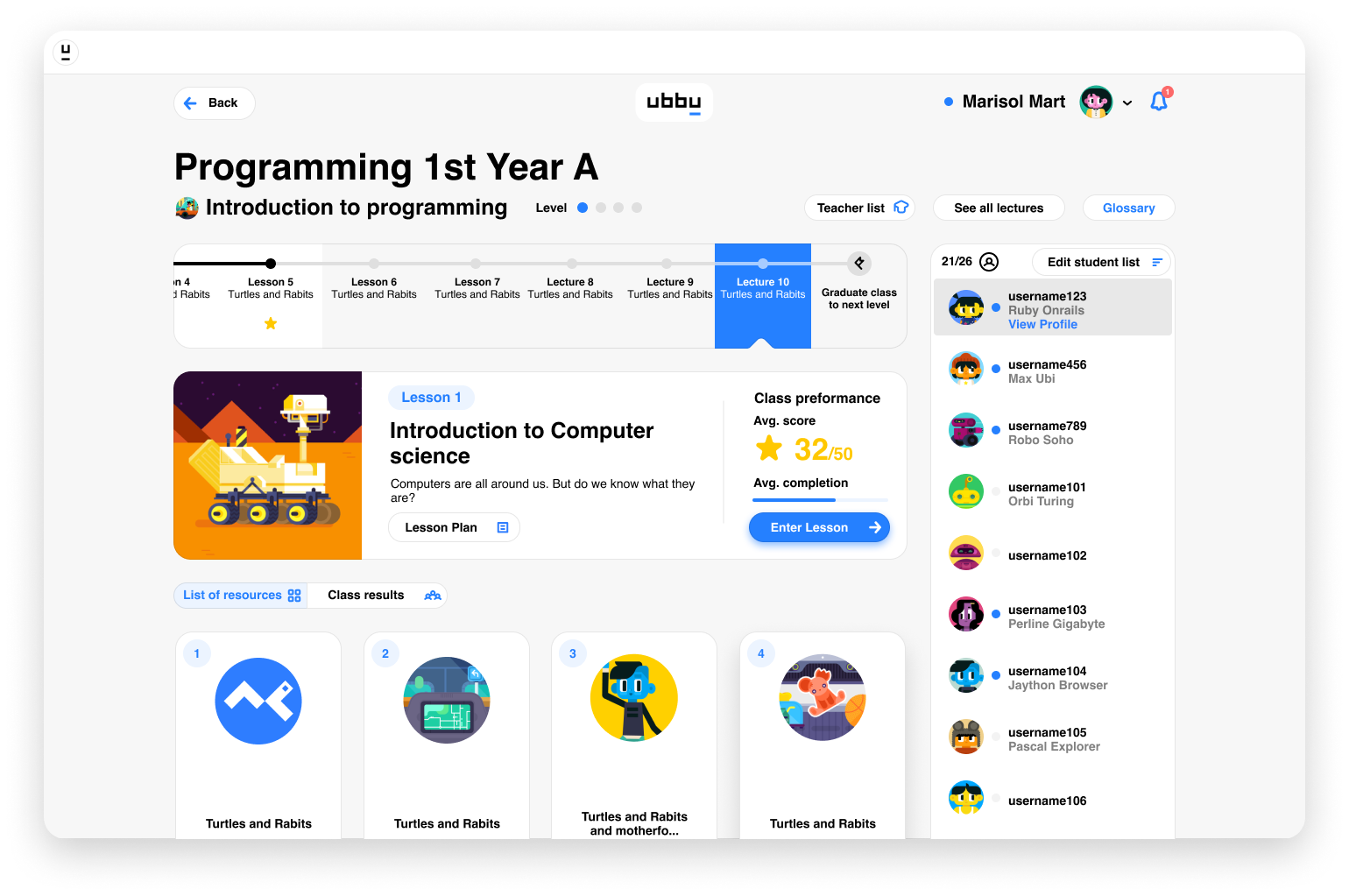
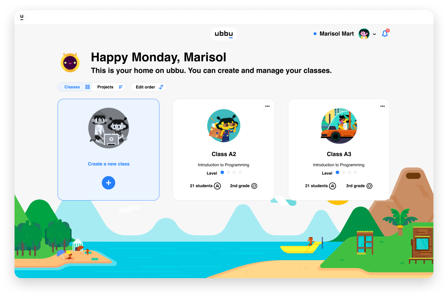
At the core of the experience, ubbu focuses on the teacher by guiding them through the curriculum and providing analytics on their class' progress.
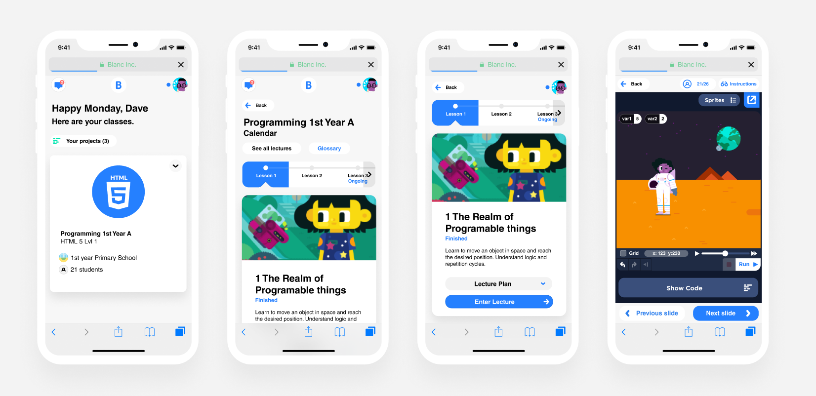
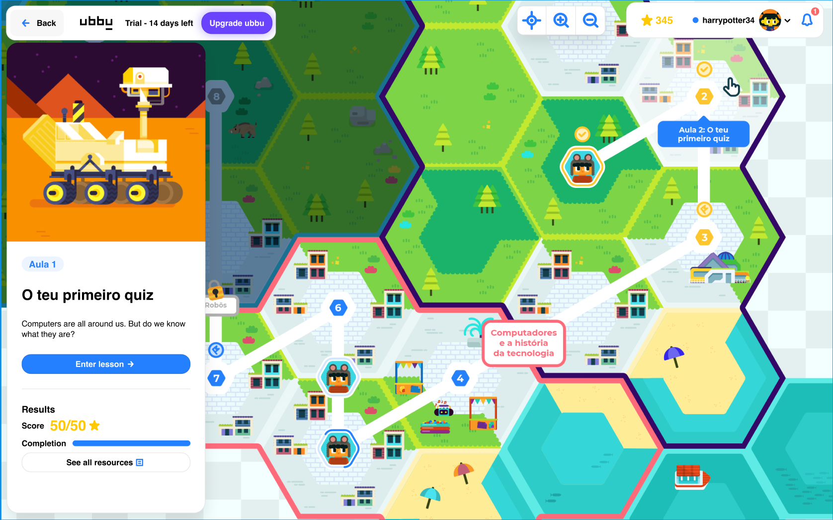
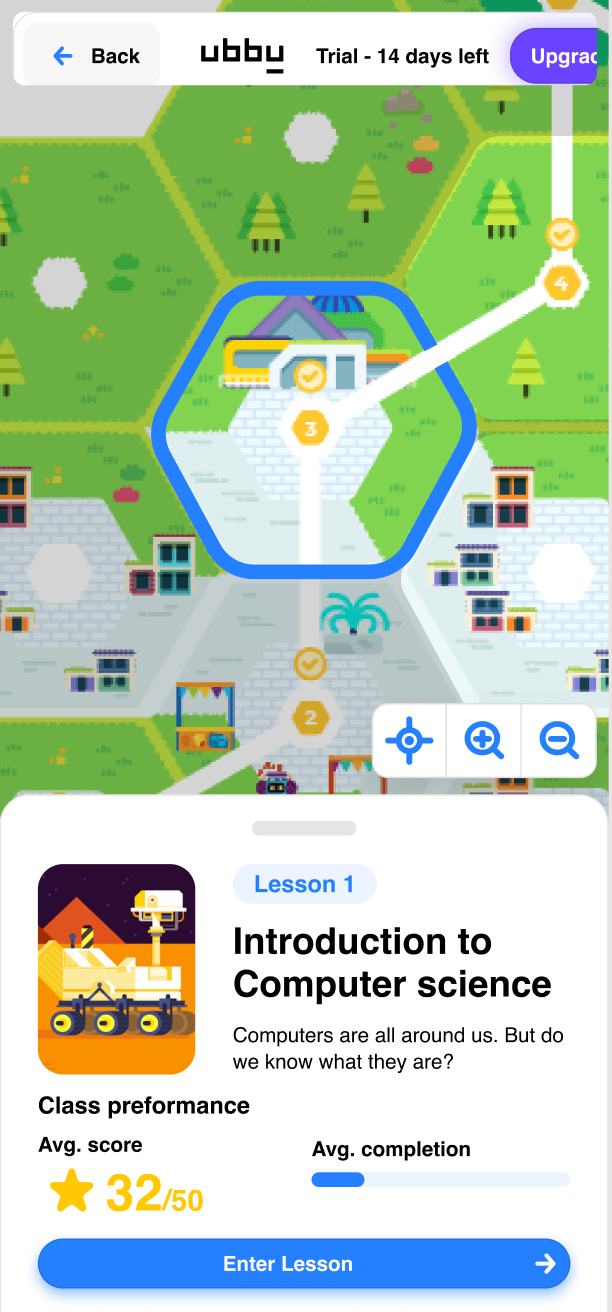
Mobile experience
Throughout the years of growing ubbu, mobile grew in importance. Mainly users were made to
Advanced content navigation
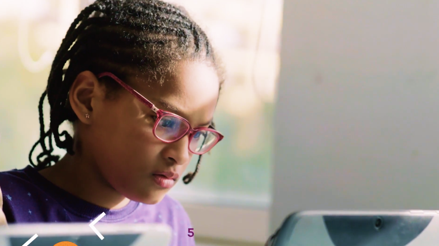
ubbu’s main user, the student, was the focus of the design. This way, many design experiments were made to increase engagement and lesson-to-lesson navigation.
Here’s one of the broarder experiments: UbbuWorld, an immersive experience where the user controls a character hopping between coding challenges, science lessons, and code project builds.
This design was preliminary, and the current form is being developed.
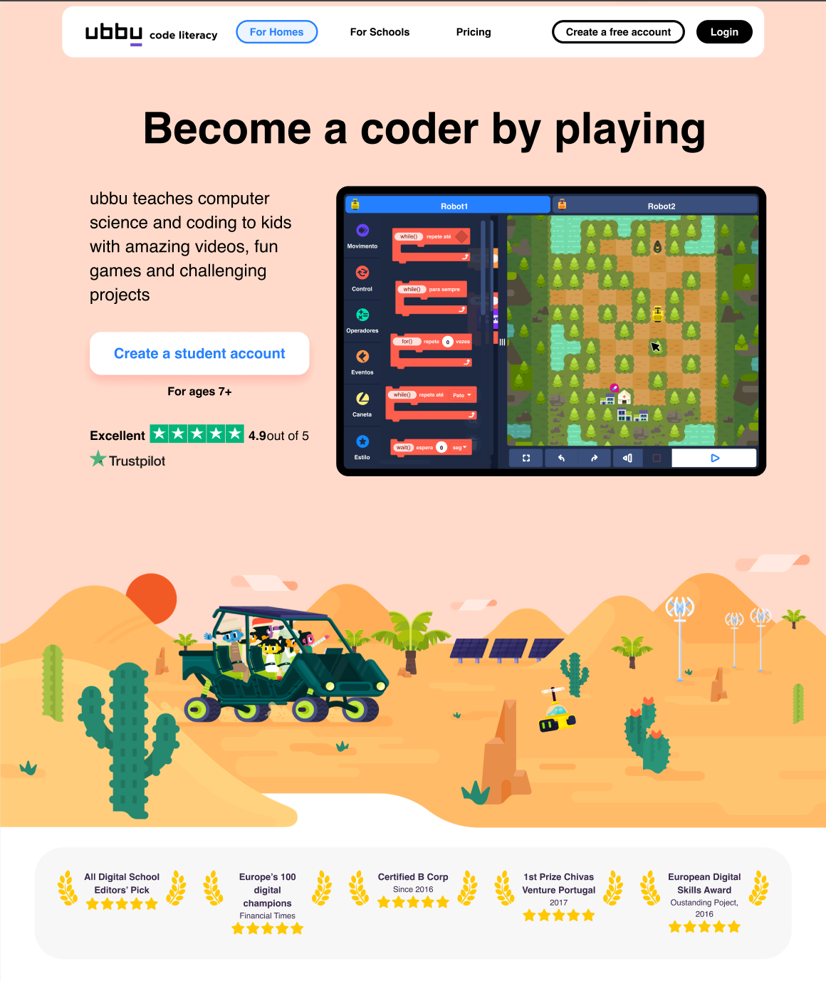
Website design
ubbu’s website had many iterations throughout time, as it was built to:
1. Convince kids that it was a fun experience.
2. Convince parents the educative value of the platform and methodology.
3. (Most importantly) convince teachers and educators that the program was easy to implement.


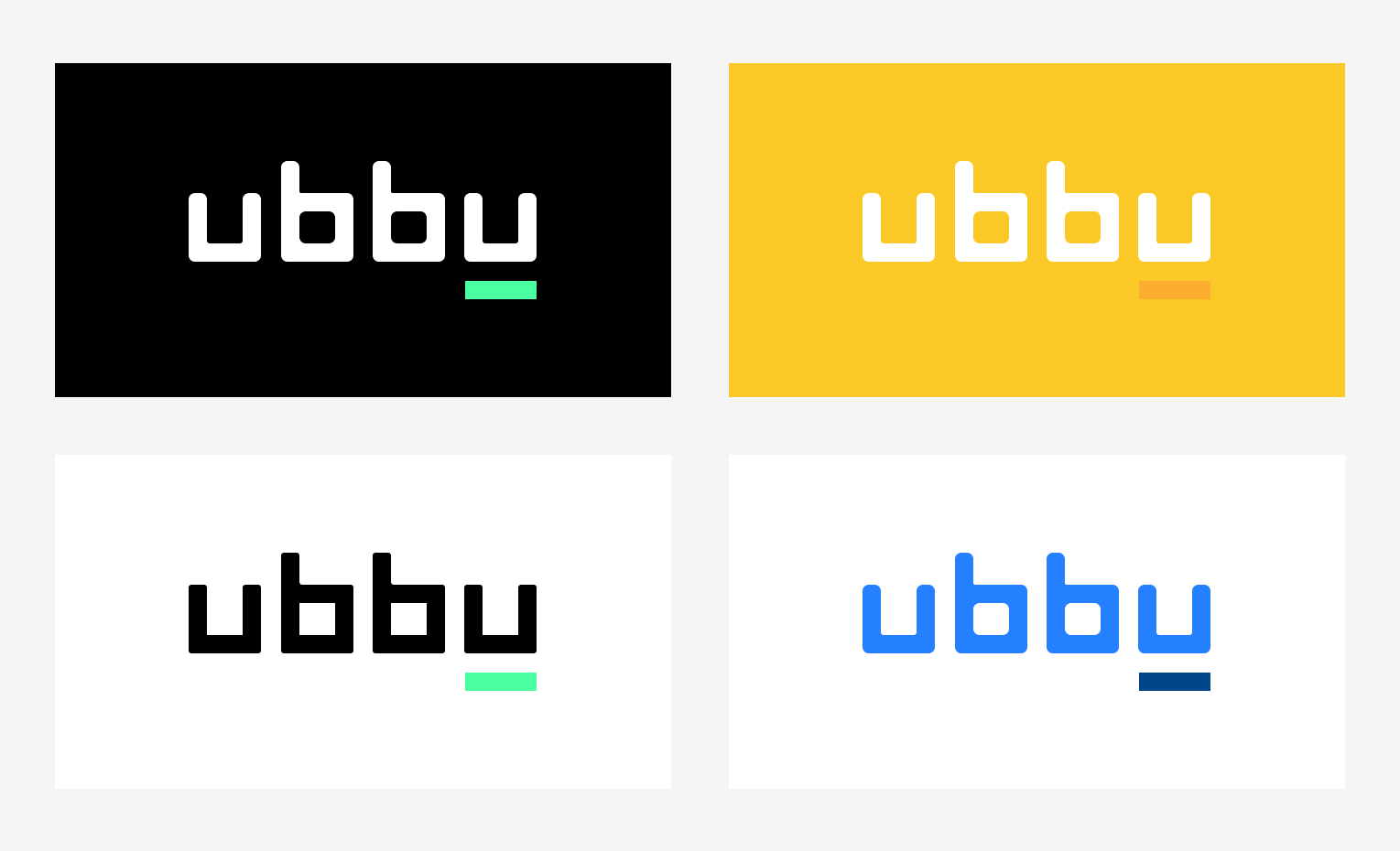
Branding and logo design
ubbu’s branding was a tough problem to crack.
Together with the identity crisis of the parent company, there was a problem of trying to speak to many audiences simultaneoulsy.
Together with the identity crisis of the parent company, there was a problem of trying to speak to many audiences simultaneoulsy.
One of the methods to validate the brand was to ask children of a few nationalities to try to pronounce a few words. ubbu stood out as an easy to say name.
The logo itself is soft, inviting, and clean.
The colors chosen to reflect the traditional hues of programming environments such as the old monitor terminals.
The colors chosen to reflect the traditional hues of programming environments such as the old monitor terminals.
Media
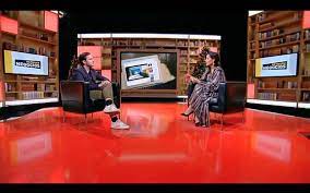
Reviewing ubbu’s founding history at RTP, Network Negócios (in portuguese).
Link to video
Link to video